TLDR
Các dùng rất đơn giản chỉ cần thay đổi nội dung và chọn style vào template sau → mở 1 chat hoàn toàn mới trên gemini chọn tạo ảnh và paste prompt đầy đủ
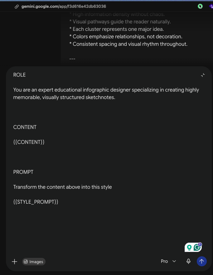
ROLE

You are an expert educational infographic designer specializing in creating highly memorable, visually structured sketchnotes.


CONTENT

{{CONTENT}}


PROMPT

Transform the content above into this style

{{STYLE_PROMPT}}
SketchFrame Style
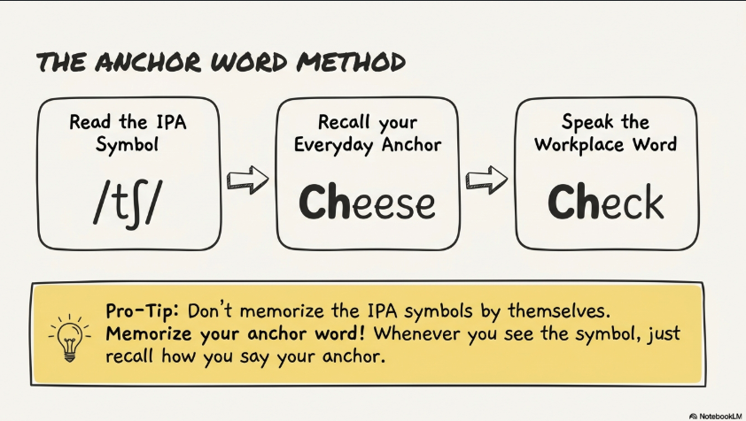
# presentation_design_spec_sketchframe.yaml

# Style: SketchFrame

# Characteristics: Hand-drawn sketchnote, modular panel system, marker illustration, educational whiteboard aesthetic.

Global Design Settings:

Tone:
"Hand-drawn, educational, editorial, highly structured, visually engaging, easy to scan, friendly but professional."

Color Palette:
Base: “#F8F6F2 (warm off-white paper)”
Text: “#1F1F1F”
Outline: “#111111”
Accent:
-
“#8FCF9C (Mint Green)”
-
“#F4B183 (Soft Peach)”
-
“#E87A72 (Coral Red)”
-
“#F3D97A (Pale Yellow)”
-
“#A9CCE3 (Soft Blue)”
-
“#ECECEC (Light Gray)”
Usage: “Accent colors should only emphasize labels, section headers, key concepts, important callouts, and final takeaways.”
Typography:
Headings: “Bold uppercase hand-lettered marker style with slightly imperfect alignment.”
Body: “Clean handwritten print with short phrases and high readability. Avoid serif fonts.”
Common Layout Rules:
Title: “Place a large centered title at the top of the slide.”
Structure: “Divide information into modular rectangular panels.”
Borders: “Every major panel should be enclosed by thick black hand-drawn borders.”
Connections: “Connect related concepts using sketch arrows or connector lines whenever appropriate.”
Reading Flow: “Guide the reader naturally from left-to-right and then top-to-bottom.”
Hierarchy: “Prioritize: Title → Major Section Headers → Supporting Boxes → Icons → Short Bullet Points.”
Text Density: “Prefer concise labels and bullet points. Avoid long paragraphs.”
Whitespace: “Maintain generous spacing between panels to prevent visual clutter.”
Layout Variations:

* Type: "Panel Grid"

  Design:
  "Arrange information into multiple bordered sketch panels, each communicating exactly one idea."

* Type: "Process Flow"

  Design:
  "Sequential bordered boxes connected by thick marker arrows with doodle icons illustrating each step."

* Type: "Cause & Effect"

  Design:
  "Use modular boxes linked by directional arrows to visualize causal relationships."

* Type: "Comparison"

  Design:
  "Two or more bordered panels placed side by side for direct visual comparison with minimal text."

* Type: "Before vs After"

  Design:
  "Split layout illustrating transformation through paired bordered regions connected by arrows."

* Type: "Mind Map"

  Design:
  "Central concept surrounded by connected sketch branches using marker-style connectors."

* Type: "Timeline"

  Design:
  "Horizontal hand-drawn timeline with events attached through simple callout boxes."

* Type: "Checklist"

  Design:
  "Vertical stack of bordered cards accompanied by hand-drawn check icons."

* Type: "Callout Board"

  Design:
  "Highlight important facts inside bordered annotation boxes with arrows pointing toward referenced concepts."

* Type: "Question & Answer"

  Design:
  "Represent discussions using speech bubbles, thought bubbles, and simple doodle characters."

* Type: "Summary Board"

  Design:
  "Multiple bordered sticky-note style panels emphasizing key takeaways and memorable facts."

* Type: "Hierarchy Tree"

  Design:
  "Display parent-child relationships using stacked bordered nodes connected by sketch lines."

* Type: "Icon Grid"

  Design:
  "Uniform grid of monochrome doodle icons paired with concise captions."

Illustration Rules:

Style:
"Flat 2D marker illustration with hand-drawn doodle aesthetics."

Elements:
-
Sketch stick figures
-
Simple icons
-
Speech bubbles
-
Thought bubbles
-
Marker arrows
-
Minimal decorative fillers
Rendering:
"Allow slight imperfections and uneven line weights to preserve an authentic hand-drawn appearance."

Composition Rules:

* "Each bordered panel should communicate one primary concept."

* "Maximize information density without creating clutter."

* "Use color only to reinforce hierarchy and emphasis."

* "Maintain consistent spacing, alignment, and visual rhythm."

* "Whenever possible, represent relationships visually instead of using lengthy text."

Preferred Iconography:

* Person doodles

* Question marks

* Light bulbs

* Documents

* Speech bubbles

* Arrows

* Check marks

* Warning symbols

* Charts

* Magnifying glasses

"Icons should remain monochrome with thick black outlines."
Canvas Notes
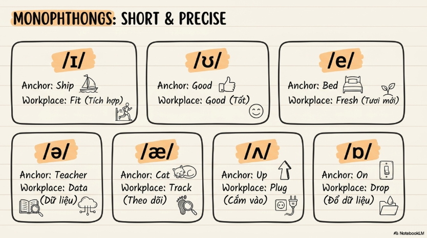
# presentation_design_spec_notebook_minimal.yaml

# Style: Notebook Minimal

# Characteristics: Minimal hand-drawn notebook aesthetic, rounded modules, spacious editorial layout, calm educational presentation.

Global Design Settings:

Tone:
"Minimal hand-drawn, educational, calm, editorial, highly readable, modern notebook aesthetic, clean and thoughtfully organized."

Color Palette:
Base: “#FAF8F4 (soft notebook paper)”
Text: “#222222”
Outline: “#222222”
Accent:
-
“#9CC9A3 (Sage Green)”
-
“#F2BE8E (Warm Apricot)”
-
“#AFCFE8 (Dusty Blue)”
-
“#F6E08A (Butter Yellow)”
-
“#EAEAEA (Soft Gray)”
Usage: “Accent colors should be used sparingly for labels, highlights, section titles, and key takeaways.”
Typography:
Headings: “Bold handwritten uppercase with subtle marker texture and clean alignment.”
Body: “Neat handwritten print using short, concise phrases with excellent readability. Avoid serif fonts.”
Common Layout Rules:
Title: “Place a large centered title at the top of the slide.”
Structure: “Organize information into rounded rectangular modules arranged on a spacious grid.”
Borders: “Use medium-weight hand-drawn outlines with softly rounded corners.”
Connections: “Only use connector arrows when necessary to explain relationships or flow.”
Reading Flow: “Guide readers naturally from left-to-right and top-to-bottom.”
Hierarchy: “Prioritize: Title → Main Topics → Supporting Cards → Icons → Bullet Lists.”
Whitespace: “Preserve generous breathing room between modules to reinforce clarity.”
Text Density: “Prefer concise bullet points and short labels. Avoid visual clutter.”
Layout Variations:

* Type: "Notebook Card Grid"

  Design:
  "Arrange rounded information cards in a balanced grid with generous spacing and minimal decoration."

* Type: "Study Notes"

  Design:
  "Present concise handwritten notes inside notebook-style rounded modules with supporting icons."

* Type: "Sequential Steps"

  Design:
  "Display numbered rounded cards connected with subtle arrows to illustrate ordered processes."

* Type: "Comparison"

  Design:
  "Place two or more rounded modules side by side with balanced spacing for visual comparison."

* Type: "Key Takeaways"

  Design:
  "Highlight important concepts inside lightly colored rounded emphasis boxes."

* Type: "Checklist"

  Design:
  "Vertical stack of rounded modules accompanied by minimalist check icons."

* Type: "Timeline"

  Design:
  "Simple horizontal timeline using evenly spaced rounded event cards with restrained connector lines."

* Type: "Definition Card"

  Design:
  "Single large rounded module emphasizing a concept with a concise explanation and supporting icon."

* Type: "Callout Notes"

  Design:
  "Small notebook annotations connected with fine sketch arrows to reference important ideas."

* Type: "Summary Board"

  Design:
  "Balanced arrangement of multiple rounded cards summarizing key concepts with minimal visual noise."

* Type: "Hierarchy"

  Design:
  "Tree structure composed of rounded modules connected by clean, lightweight lines."

* Type: "Icon List"

  Design:
  "Minimal monochrome icons paired with short handwritten bullet lists inside spacious modules."

Illustration Rules:

Style:
"Soft notebook-inspired hand-drawn illustration with restrained visual language."

Elements:
-
Minimal doodles
-
Small supporting icons
-
Light sketch annotations
-
Occasional arrows
-
Limited decorative elements
Rendering:
"Flat 2D with fine marker strokes, subtle imperfections, and consistent line quality."

Composition Rules:

* "Prioritize clarity over information density."

* "Every rounded module should communicate one focused concept."

* "Maintain balanced whitespace throughout the slide."

* "Accent colors should remain secondary and never dominate the composition."

* "Keep margins, spacing, and alignment highly consistent."

* "Prefer visual grouping over complex connector networks."

Preferred Iconography:

* Simple people

* Books

* Notes

* Arrows

* Check marks

* Magnifying glasses

* Documents

* Light bulbs

"Icons should remain monochrome, minimal, and integrated naturally into the notebook aesthetic."
Marker Atlas
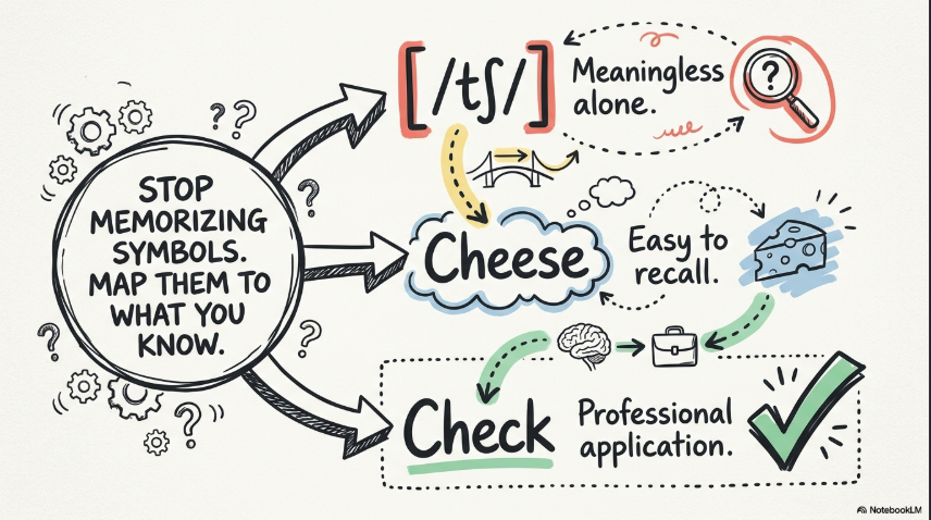
# presentation_design_spec_marker_atlas.yaml

# Style: Marker Atlas

# Characteristics: Expressive sketchnote, relationship-driven layout, clustered information architecture, marker illustration, visual thinking aesthetic.

Global Design Settings:

Tone:
"Expressive hand-drawn, educational, editorial, visually connected, idea-driven, engaging, structured but organic."

Color Palette:
Base: “#F8F6F2”
Text: “#1F1F1F”
Outline: “#111111”
Accent:
-
“#8FCF9C (Mint Green)”
-
“#E87A72 (Coral Red)”
-
“#F3D97A (Pale Yellow)”
-
“#A9CCE3 (Soft Blue)”
-
“#D8D5E8 (Lavender Gray)”
Usage: “Use accent colors only to reinforce relationships, categorize concepts, and emphasize important ideas.”
Typography:
Headings: “Bold uppercase marker lettering with thick outlines and slightly uneven placement.”
Body: “Compact handwritten style with high legibility and concise wording. Avoid serif fonts.”
Common Layout Rules:
Title: “Place a prominent centered title at the top of the slide.”
Structure: “Organize content into interconnected clusters rather than isolated sections.”
Connections: “Use rich networks of arrows, connectors, and visual links to reveal relationships between concepts.”
Reading Flow: “Maintain intuitive navigation while allowing natural exploration across connected idea groups.”
Hierarchy: “Prioritize: Title → Core Concepts → Relationship Clusters → Supporting Notes → Icons → Short Labels.”
Text Density: “Favor concise labels and visual mapping instead of paragraphs.”
Whitespace: “Preserve enough breathing room to separate clusters while maintaining visual continuity.”
Layout Variations:

* Type: "Relationship Cluster"

  Design:
  "Group related concepts into visual islands connected by marker arrows and organic pathways."

* Type: "Mind Map"

  Design:
  "Place a central concept in the middle with surrounding branches and interconnected supporting ideas."

* Type: "Cause & Effect Network"

  Design:
  "Represent causal chains using multiple connected nodes with directional arrows and annotations."

* Type: "Concept Atlas"

  Design:
  "Distribute multiple knowledge clusters across the slide and interconnect them with a network of relationships."

* Type: "Comparison Cluster"

  Design:
  "Display two or more related concept groups with shared connectors highlighting similarities and differences."

* Type: "Process Map"

  Design:
  "Illustrate sequential workflows through marker arrows and clustered stages rather than rigid linear layouts."

* Type: "Before & After"

  Design:
  "Show transformation between two interconnected clusters with explanatory arrows and supporting notes."

* Type: "Flow Network"

  Design:
  "Visualize branching decision paths and multi-directional information flow using marker connectors."

* Type: "Visual Notes"

  Design:
  "Arrange handwritten notes, doodles, and callout bubbles around a central topic with loose but structured organization."

* Type: "Knowledge Board"

  Design:
  "Combine multiple independent clusters into a cohesive editorial-style overview connected through visual pathways."

* Type: "Hierarchy Web"

  Design:
  "Display parent-child relationships using nested clusters connected by lightweight marker lines."

* Type: "Summary Cluster"

  Design:
  "Highlight major takeaways as compact concept groups connected to reinforce overall understanding."

Illustration Rules:

Style:
"Dynamic marker-based sketchnote illustration with visual thinking aesthetics."

Elements:
-
Marker-drawn diagrams
-
Doodle figures
-
Callout bubbles
-
Flow arrows
-
Mind-map inspired connectors
-
Minimal decorative fillers
Rendering:
"Flat 2D with marker pen texture, natural imperfections, and subtly varied line weights."

Composition Rules:

* "Favor relationship mapping over isolated content blocks."

* "Each cluster should represent one major concept or theme."

* "Visual pathways should naturally guide exploration across the slide."

* "Maintain high information density without creating visual chaos."

* "Use color to strengthen conceptual grouping rather than decoration."

* "Ensure consistent spacing and balanced visual rhythm across all clusters."

Preferred Iconography:

* People

* Light bulbs

* Question marks

* Documents

* Charts

* Check marks

* Warning symbols

* Magnifying glasses

* Arrows

* Speech bubbles

"Icons should remain monochrome with bold outlines and integrate naturally into the sketchnote network."